Our client, large paint manufacturer, was looking to better understand what consumers need from visualisation tools to increase their confidence in their home improvement project. After poor reviews and complaints with our clients existing tools, we sought to help them re-prioritise their approach by taking a step back and understanding how their customers think.
We interviewed 22 consumers with interior painting projects and
condensed our findings into a report covering mental models, pain
points, motivators and needs. By addressing the perception of
current colour support touchpoints and framing the research with a
'Jobs to be Done' lens, our clients were better equipped to
participate in our facilitated ideation workshops.
I'm proud to say the success of this client project directly
contributed to my promotion.
3 months
One of the biggest challenges was that our client already had incredible amount of market research on their customers. This included market segmentation, triggers, experience maps and more. What else could we tell them they didn't already know? However it was clear that our client didn't know how to translate it into a product context. While their siloed market research team was off generating insights, their product team was largely running their roadmap blind. I knew we would have to present our research in a completely different way.
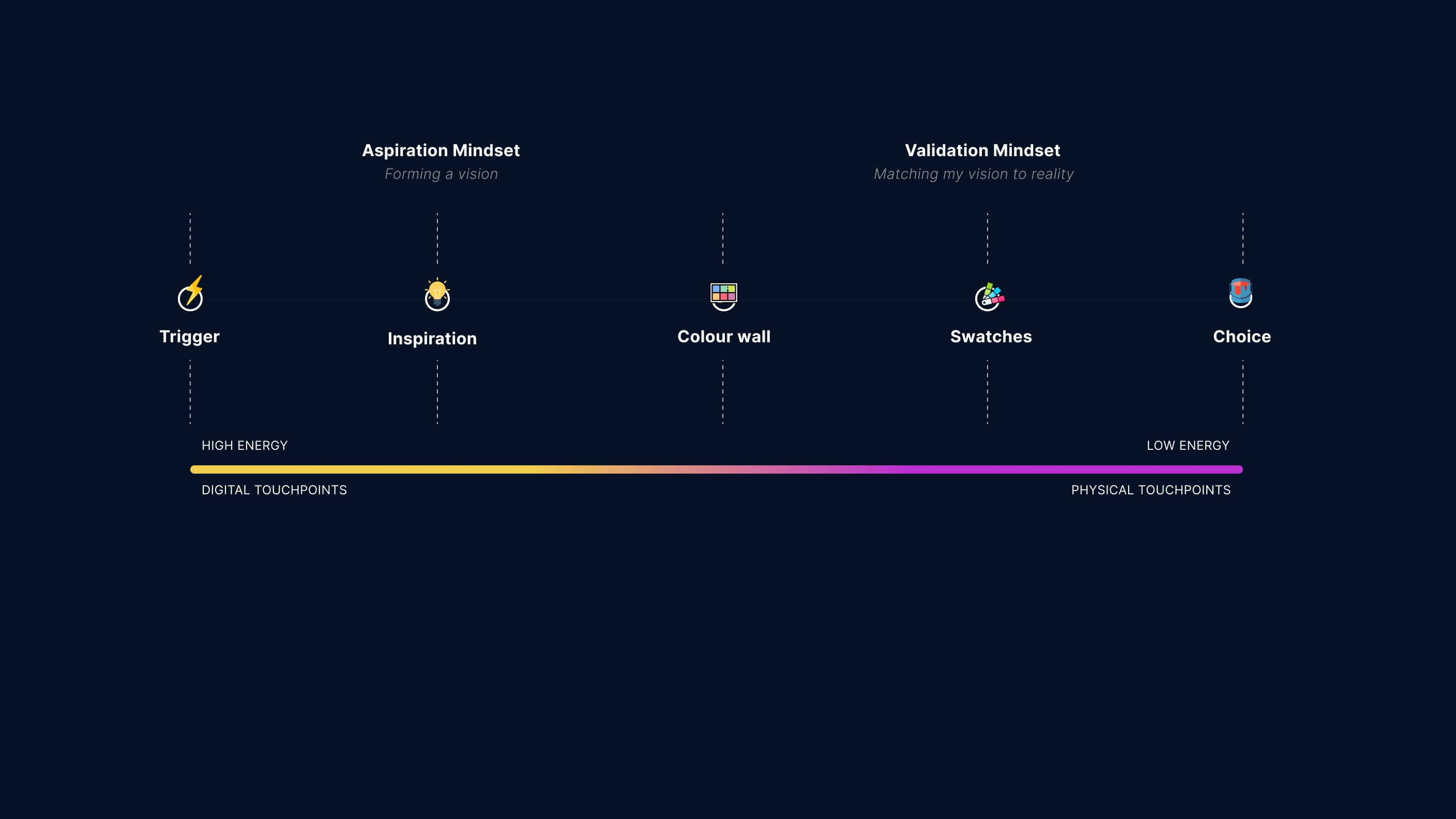
We discovered two main mindsets a consumer could find themselves in: aspiration or execution. When consumers were in an aspiration mindset, they were shaping their vision based on a multitude of factors, desires and limitations. This phase was largely high energy and conducted digitally on sites such as Pinterest or renovation advice articles. Things such as the type of room it needed to be, social pressure, harmony with furniture and the environmental feeling they wanted to create, all impacted the percieved possible colour choices. Once the consumer tried to match that abstract vision with the reality of paint swatches on offer, anxieties rose in response to choice overload.
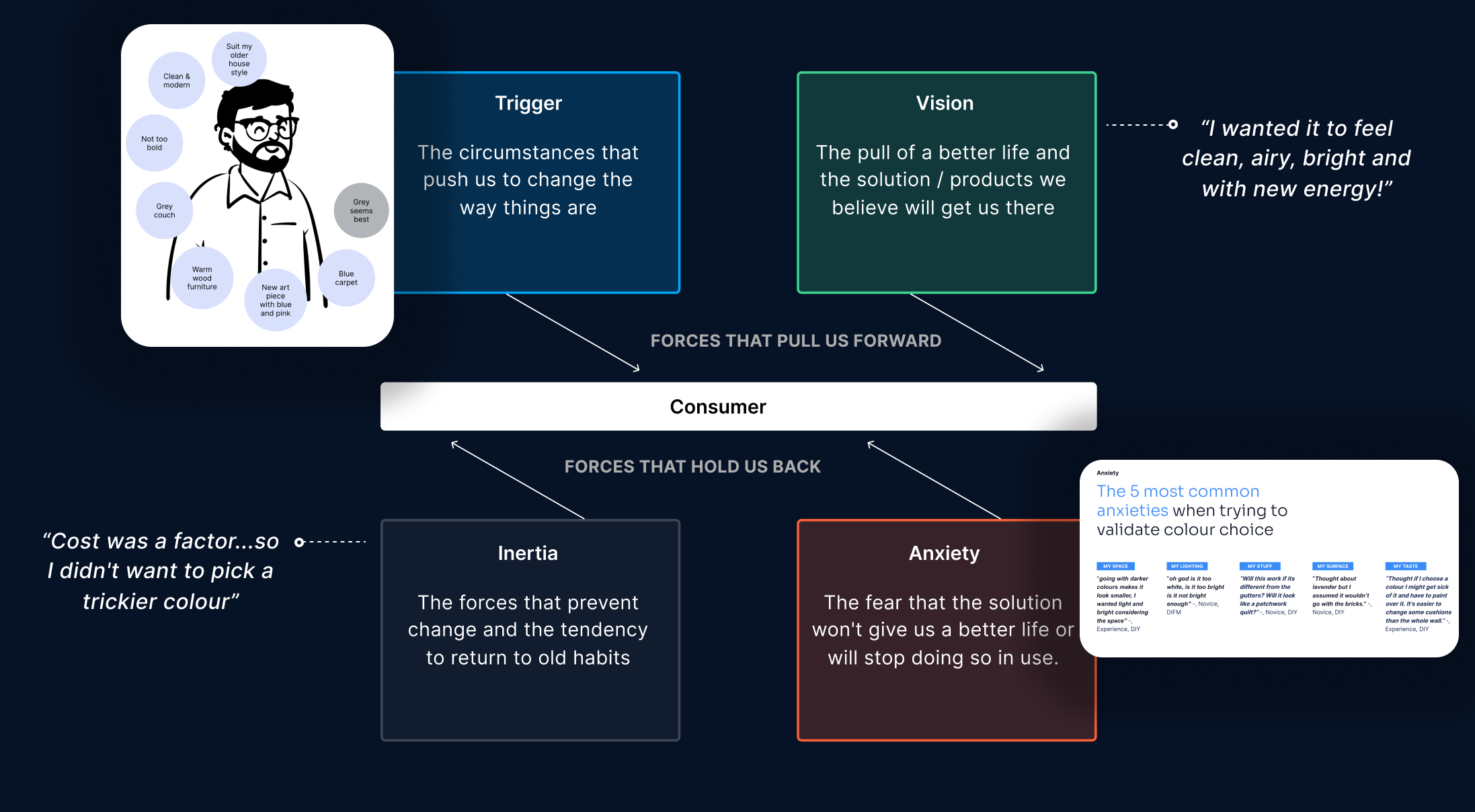
Inspired by the book 'When coffee and kale compete', I decided to frame the research report in the 4 forces of progress: Trigger, Vision, Anxiety and Inertia. This approach worked really well to organise the otherwise overwhelming amount of insights we had gathered. Our client especially understood the need to reduce anxiety and inertia of colour choice. Thsi led to ideas of personalisation and self segmentation tools on their website.
Another challenge we came across was the inherent disinterest of managers outside of the product team in our project. The siloed nature of their business had led to a misalignment across strategies and our client, Head of Product & Web, was struggling to unite them. However our differentiated research report presentation as well as multiple ideation workshops sparked the interest and engagement of many stakeholders, getting them to debate and work together as they don't normally do.
This project was very well received by our client’s team and contributed to the re-prioritisation of their product roadmap in alignment with other stakeholders projects across other touchpoints. While it didn't lead to the change management that they desperately need, it was a nod in the right direction.
I was the primary consultant and contact on this project, in charge of stakeholder management, insight analysis and workshop facilitation.
Working with 1 other researcher, I led the majority of the interviews with consumers yet also took notes sometimes so that I could improve and refine my technique from an observers perspective.
When my research partner unfortunately had to take time off sick, I stepped up to continuing our affinity mapping and insight analysis. Leaning on my design skills, I packaged the insights into a punchy and visual presentation which I presented to their team of senior stakeholders.
I saw very clearly on this project the difference between market insights and behavioural insights. Ideally they are used in tandem with UX research to design a well rounded service that addresses consumer needs at each touchpoint, flowing seamlessly to the next.
The second thing I learned was how much I enjoyed working on a pure research project, giving people the space to talk about their experiences. People just light up when connect with others and they feel heard.
